
This is the story of the Not Just Bendy Hypermobility Mascot and Logo.
Zebras are the adopted symbol of Ehlers-Danlos Syndrome (EDS). The story goes that at medical school, future doctors are taught to look for conventional explanations: “If you hear hoof beats look for horses.”
This communicates the idea that common symptoms are usually due to the most common explanation.
The zebra represents more rare conditions (such as EDS) and the idea that “When you hear hoof beats, if you only think of horses, you will be missing the zebras.”
It encourages the medical community to think outside the box, and consider EDS/connective tissue disorders as a possible underlying diagnosis
It is also described in the famous EDS slogan:
“If you can’t connect the issues, think connective tissues.”
Now regardless of whether we consider hypermobile-EDS “rare”, the Zebra has stuck as the mascot of the movement. The mascot for Not Just Bendy Hypermobility services is the lovable Zebby, created by the artist Chloe Wigg.
The original Zebby was the first zebra I bought as an adult, and still sits on the desk watching me write this blog. I bought him when I first began to feel connected to the EDS community – firstly as a “bendy” myself, secondly as the mother of some, and finally as a physiotherapist to many.
Next, Zebby became art.
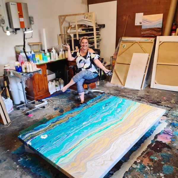
Chloe Wigg (who is a client of mine) asked to paint my portrait for a competition on “influential people of Brisbane.” Portrait painting is not Chloe’s usual creative category. Recently her preferred genre is acrylic medium pouring painting; she struggles with more traditional painting formats due to her own H-EDS.
In exciting upcoming news, Chloe is holding her first solo art show “Natural Resilience” from 19th January 2021 at Logan Art Gallery.
A little more info about Chloe.
She took up art as therapy after a career-ending arm injury when she was a young paramedic. She took up art while having rehabilitation in hospital as a way to cope with crippling pain: often referred to as Art Therapy.
When I met Chloe, she knew she was hypermobile, but had never heard of the complexity of it all. Over time we began to deal with many of her issues associated with that hypermobility. Despite all the challenges Chloe has faced she always remains positive, and a ray of happiness for those around her. I am so proud of her for continuing with her art, raising her family, and remaining so positive about whatever is around the corner.
To support Chloe you can follow her blog, Facebook or Instagram. Or if you see/hear her in the waiting room – please introduce yourself as she loves making connections.
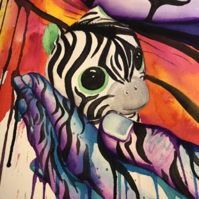
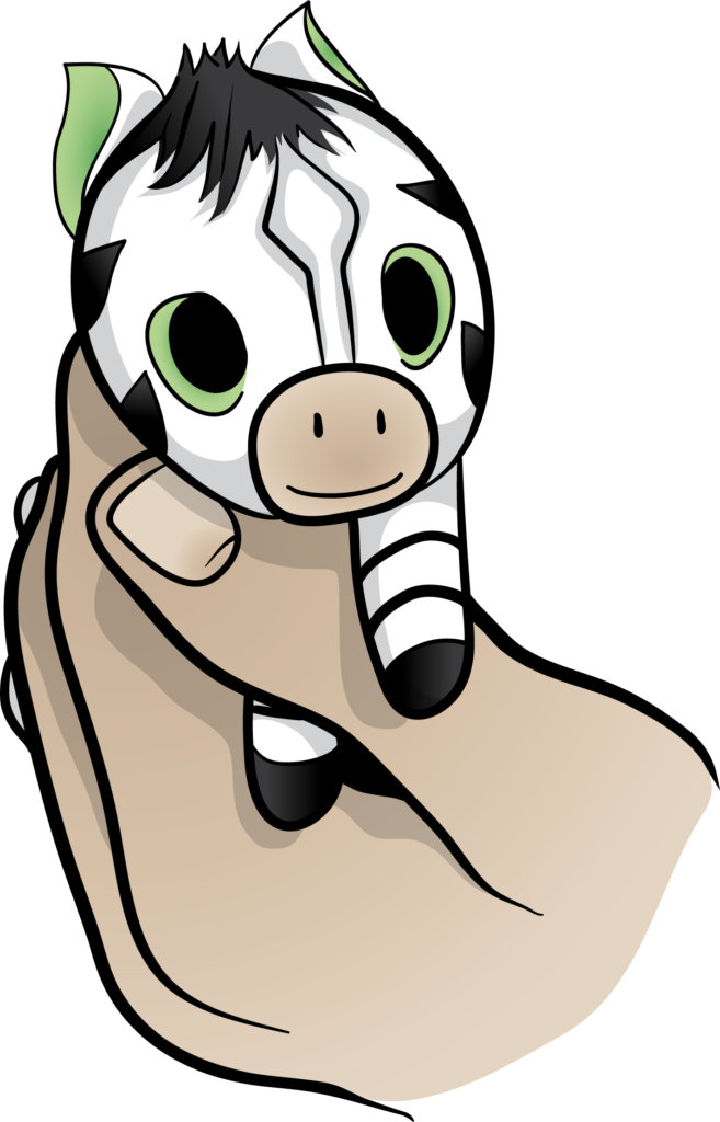
Anyway, let’s say the portrait was never entered in the competition, but a cute little Zebby in the corner became legend (see above). It is the combination of Zebby and the zebra patterned hand that together signify the goals of the Not Just Bendy Hypermobility Services. Cradling the zebra with our hands and helping support and help anyone with hypermobility.
Zebby was then redrawn, and developed into vector art to be the official logo for Not Just Bendy Hypermobility Services.
But it turned out he was just too cute to be on our cards and letterheads especially as we are an adult physiotherapy service, and most of the people I asked didn’t understand the Zebra reference anyway (even those with EDS). It broke my heart to figuratively go back to the drawing board (and literally send Chloe back to her drawing board) and find a different image to represent Not Just Bendy but as I have discovered over the last six months there were many tricky business decisions to make every week.
Chloe was not discouraged and sketched us a new image based on the zebra patterned hand from the original painting. On the third go she produced the drawing that was turned into our logo.
I love our logo – it signifies,to me, someone who is moving happily but is also finding it hard to keep their head, body, and legs all connected. Just like Chloe and so many of my other clients who also inspire me on a daily basis. The overlapping purple, blue, and green coloured body parts signify the multiple layers of muscle that need to co-ordinate their activation patterns to allow functional, efficient and pain-free movement. It also reminds me of maintaining alignment while standing on one leg (which most of my clients know is much more difficult than you would think).
Read more about Chloe Wigg: How art saved her life https://alistrachan.com/feature-artist-chloe-wigg-how-art-saved-her-life/
To learn more about Not Just Bendy Hypermobility Services you can read about us here.